How to Integrate a Bootstrap Menu Into your WordPress website

This Tutorial will teach you how to integrate Bootstrap 4 menu in your WordPress Theme. You can use it to make your WordPress Menu Responsive i.e. the menu will be collapsed and toggleable in mobile screens, but for tablets and computer screen (big screens) it will remain fully visible.
Check out my other Bootstrap 4 Tutorials for Beginners:
Bootstrap Menu (Navbar)
Let start understanding the HTML structure of the Bootstrap menu. The HTML code is like this:
<nav class="navbar navbar-expand-lg navbar-light bg-light">
  <div class="container-fluid">
    <a class="navbar-brand" href="#">Navbar</a>
    <button class="navbar-toggler" type="button" data-bs-toggle="collapse" data-bs-target="#navbarSupportedContent" aria-controls="navbarSupportedContent" aria-expanded="false" aria-label="Toggle navigation">
      <span class="navbar-toggler-icon"></span>
    </button>
    <div class="collapse navbar-collapse" id="navbarSupportedContent">
      <ul class="navbar-nav me-auto mb-2 mb-lg-0">
        <li class="nav-item">
          <a class="nav-link active" aria-current="page" href="#">Home</a>
        </li>
        <li class="nav-item">
          <a class="nav-link" href="#">Link</a>
        </li>
        <li class="nav-item dropdown">
          <a class="nav-link dropdown-toggle" href="#" id="navbarDropdown" role="button" data-bs-toggle="dropdown" aria-expanded="false">
            Dropdown
          </a>
          <ul class="dropdown-menu" aria-labelledby="navbarDropdown">
            <li><a class="dropdown-item" href="#">Action</a></li>
            <li><a class="dropdown-item" href="#">Another action</a></li>
            <li><hr class="dropdown-divider"></li>
            <li><a class="dropdown-item" href="#">Something else here</a></li>
          </ul>
        </li>
        <li class="nav-item">
          <a class="nav-link disabled" href="#" tabindex="-1" aria-disabled="true">Disabled</a>
        </li>
      </ul>
      <form class="d-flex">
        <input class="form-control me-2" type="search" placeholder="Search" aria-label="Search">
        <button class="btn btn-outline-success" type="submit">Search</button>
      </form>
    </div>
  </div>
</nav>
- a. The button, with class navbar-toggler, will be the toggleable button. This will show only on mobile screens and will be invisible for larger screens.
- b. The div, with id navbarSupportedContent, contains the menu items (i.e links). They will show up in horizontal manner on larger screens (Desktops and laptops), but on mobile screens they will come down one below the other (opening and closing option with the toggleable button).
The main problem is that it is a static menu but WordPress menu is dynamic (created from dashboard). So to solve this problem we will be using Nav Walker Class which will automatically convert the WordPress menu structure to that of Bootstrap’s Menu.
Nav Walker Class
To use Nav Walker Class first download class-wp-bootstrap-navwalker.php from GitHub.
- 1. Place this class-wp-bootstrap-navwalker.php file in your WordPress theme folder.
- 2. Open your functions.php file and register Nav Walker class by adding the below line:
/** * Register Custom Navigation Walker */ function register_navwalker(){ require_once get_template_directory() . '/class-wp-bootstrap-navwalker.php'; } add_action( 'after_setup_theme', 'register_navwalker' ); - 3. Register your menu in the functions.php file by adding these below lines:
/*Navigation Menus*/ function register_my_menu() { register_nav_menu('header-menu',__( 'Header Menu' )); } add_action( 'init', 'register_my_menu' ); /*End*/ - 4. Add the below code in your theme’s header.php file.
<nav class="navbar navbar-expand-md navbar-light bg-light" role="navigation">
  <div class="container">
    <!-- Brand and toggle get grouped for better mobile display -->
    <button class="navbar-toggler" type="button" data-toggle="collapse" data-target="#bs-example-navbar-collapse-1" aria-controls="bs-example-navbar-collapse-1" aria-expanded="false" aria-label="<?php esc_attr_e( 'Toggle navigation', 'your-theme-slug' ); ?>">
        <span class="navbar-toggler-icon"></span>
    </button>
    <a class="navbar-brand" href="#">Navbar</a>
        <?php
        wp_nav_menu( array(
            'theme_location'    => 'primary',
            'depth'             => 2,
            'container'         => 'div',
            'container_class'   => 'collapse navbar-collapse',
            'container_id'      => 'bs-example-navbar-collapse-1',
            'menu_class'        => 'nav navbar-nav',
            'fallback_cb'       => 'WP_Bootstrap_Navwalker::fallback',
            'walker'            => new WP_Bootstrap_Navwalker(),
        ) );
        ?>
    </div>
</nav>
Note: I have updated the wp_nav_menu() function by adding fallback_cb & walker item to it.
The menu_class is provided value of nav navbar-nav which you can change.
This completes our integration now let us check responsiveness of our menu.
Checking WordPress Bootstrap Menu in Different Screen Sizes
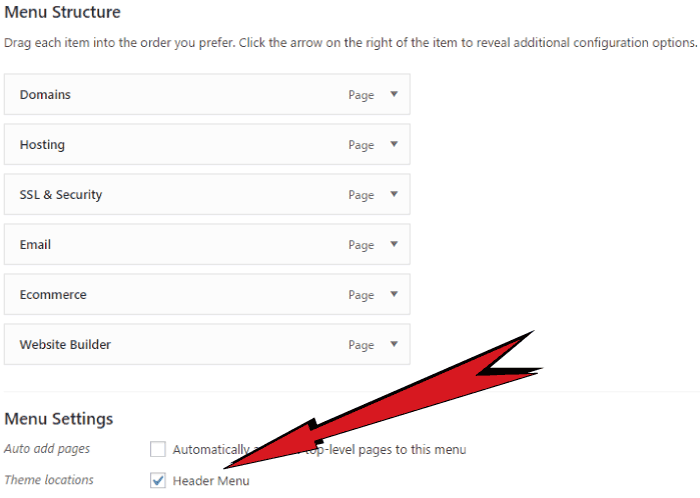
In your WordPress Dashboard create a new menu and assign it’s Theme Locations as Header Menu.
Add a few items to this menu and save it.
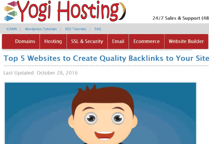
Now when you open the website in laptop the menu will be fully visible.
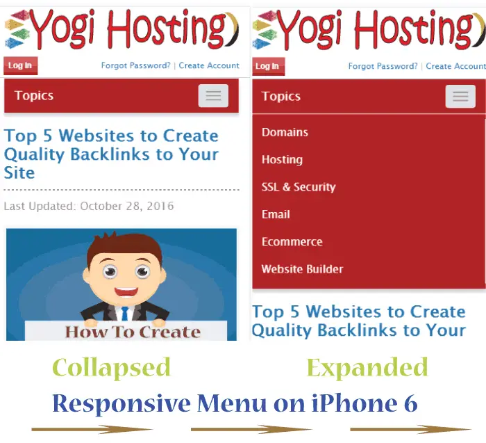
When viewing it in smaller screens of smartphones, it will show up in collapsed and toggleable form.
Bootstrap is easy to use and most popular HTML, CSS, and JS framework for developing responsive website. I would recommend you to use it as it greatly increases the speed of development.
If you like this article then share it with your friends in facebook, twitter and pinterest.
SHARE THIS ARTICLE
Related Tutorials:


ABOUT THE AUTHOR
I hope you enjoyed reading this tutorial. If it helped you then consider buying a cup of coffee for me. This will help me in writing more such good tutorials for the readers. Thank you.
Please Consider Donating us
We are helping millions of Beginners and Professionals to learn new programming technologies.
Please consider donating us:


HELLO EVERYONE
 Welcome to YogiHosting - A Programming Tutorial Website. It is used by millions of people around the world to learn and explore about ASP.NET Core, Blazor, jQuery, JavaScript, Docker, Kubernetes and other topics.
SUBSCRIBE TO NEWSLETTER
Enter your email address to subscribe to this blog and receive notifications of new posts by email.
Join 90K other subscribers