How to Use Bootstrap to Create Responsive Design

If you are looking to use Bootstrap in your website then this tutorial will teach you from the starting point. You just need a basic knowledge of HTML and CSS to use Bootstrap. After completing this tutorial you will reach an expert level from where you can develop any sort of responsive website.
In this tutorial I will use Bootstrap 4 and 5 in a web page to make it responsive. You can also check this tutorial – What is Bootstrap, to learn about the offerings of this framework in depths.
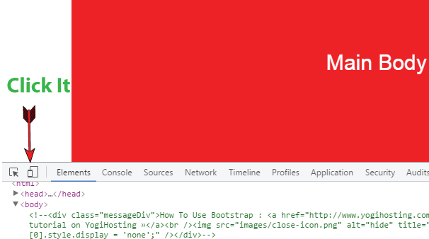
The layout is made in HTML and has three main parts:
- 1. Header – which contains the logo image on the left and a div on the right.
- 2. Body – has two parts, Main Content div on the left and a Sidebar div on the right.
- 3. Footer – containing site’s copyright information.
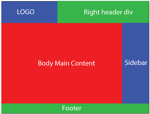
The image below illustrates this layout when viewed in larger screens – like that of laptops and computers:
Obviously this layout is not responsive at all. On bigger screens (like that of laptops and PCs) it will look good but on smaller screens of smartphones (iphones, galaxys, etc) and tablets it won’t fit properly.
There will be horizontal scroll to reach from one portion on the left to the other portion on the right. The text and image will be displayed as very small and you will have to zoom in to read the small text.
To make it responsive I will use Bootstrap, and using it, I will break the larger parts of the layout, that don’t fit in smaller screen, into smaller parts that come down to the next row whenever the screen size becomes smaller.
So this makes the web page to have no horizontal scroll and also no small and unreadable texts.
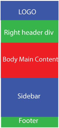
In smaller screen sizes this layout should look like this:
☺ Now I will show how to use Bootstrap.
How to Use Bootstrap 4 in the Web Page
In order to use Bootstrap in our web page you first need to add the reference to necessary Meta tags and Bootstrap’s CSS/JS files. The below steps explain how to do this:
- After the page title, first include the two metas – meta charset and meta viewport.
- Then reference the bootstrap.css file followed by your website style sheet.
- In the end, before </body> tag add reference to ‘jQuery’, ‘Popper JS’ and ‘bootstrap.js’ files.
This is how the HTML of our web page looks:
<!DOCTYPE html>
<html>
    <head>
        <title>Page Title</title>

        <!-- Required meta tags -->
        <meta charset="utf-8">
        <meta name="viewport" content="width=device-width, initial-scale=1, shrink-to-fit=no">

        <!--Bootstrap CSS Reference-->
        <link href="css/bootstrap.css" rel="stylesheet" />

        <!--Website Style Sheet Reference-->
        <link href="css/style.css" rel="stylesheet" />
    </head>
    <body>

        <!-- jQuery first, then Popper.js, then Bootstrap JS -->
        <script src="https://code.jquery.com/jquery-3.2.1.slim.min.js" integrity="sha384-KJ3o2DKtIkvYIK3UENzmM7KCkRr/rE9/Qpg6aAZGJwFDMVNA/GpGFF93hXpG5KkN" crossorigin="anonymous"></script>
        <script src="https://cdnjs.cloudflare.com/ajax/libs/popper.js/1.12.9/umd/popper.min.js" integrity="sha384-ApNbgh9B+Y1QKtv3Rn7W3mgPxhU9K/ScQsAP7hUibX39j7fakFPskvXusvfa0b4Q" crossorigin="anonymous"></script>
        <script src="https://maxcdn.bootstrapcdn.com/bootstrap/4.0.0/js/bootstrap.min.js" integrity="sha384-JZR6Spejh4U02d8jOt6vLEHfe/JQGiRRSQQxSfFWpi1MquVdAyjUar5+76PVCmYl" crossorigin="anonymous"></script>
    </body>
</html>
The Bootstrap CSS and JS and Popper jS files are referenced them from CDN. You can also download the bootstrap package in the website folder and reference these files from there
How to Use Bootstrap 5
Bootstrap 5.0 is the latest version right now and it works without jQuery. So you just have to only reference css and bundle js. Note that bundle js file includes popper js in it. See the highlighted code below for the references of bootstrap 5.0 css and bundle js files in the html page.
<!DOCTYPE html>
<html>
    <head>
        <title>Page Title</title>

        <!-- Required meta tags -->
        <meta charset="utf-8">
        <meta name="viewport" content="width=device-width, initial-scale=1, shrink-to-fit=no">

        <!--Bootstrap CSS Reference-->
        <link href="https://cdn.jsdelivr.net/npm/[email protected]/dist/css/bootstrap.min.css" rel="stylesheet" integrity="sha384-+0n0xVW2eSR5OomGNYDnhzAbDsOXxcvSN1TPprVMTNDbiYZCxYbOOl7+AMvyTG2x" crossorigin="anonymous">

        <!--Website Style Sheet Reference-->
        <link href="css/style.css" rel="stylesheet" />
    </head>
    <body>

        <!--  Bootstrap Bundle with Popper -->
        <script src="https://cdn.jsdelivr.net/npm/[email protected]/dist/js/bootstrap.bundle.min.js" integrity="sha384-gtEjrD/SeCtmISkJkNUaaKMoLD0//ElJ19smozuHV6z3Iehds+3Ulb9Bn9Plx0x4" crossorigin="anonymous"></script>

    </body>
Now I are ready to use bootstrap responsive features but before that I need to explain you the Bootstrap Grid system and how it works. Note that the Bootstrap Grid is same for both 4.0 and 5.0 versions.
Understanding Bootstrap Grid
The Bootstrap Grid system is used to create responsive design through a series of rows and columns. There can be maximum of 12 columns in a row. The rows (.row) are placed under a .container (fixed-width) or .container-fluid (full-width) div.
The columns width can be defined for phones, tablets, desktops or larger screen by any of the following 4 class prefix:
| Extra small devices Phones (<576px) | Small devices Tablets (≥576px) | Medium devices Laptops (≥768px) | Large devices Desktops (≥992px) | Extra Large devices Large Desktops (≥1200px) | |
|---|---|---|---|---|---|
| Max Container Width | None (auto) | 540px | 720px | 960px | 1140px |
| Class prefix | .col-* | .col-sm-* | .col-md-* | .col-lg-* | .col-xl-* |
For * you can put numbers from 1 to 12. The * play a significant role in providing width to the column.
The class with prefix sm, md, lg and xl correspond to the width of the device. See the above table for their screen width.
These class prefix plays an important role in responsiveness and tells at what screen size the columns remains horizontally floated in a row and when they slack.
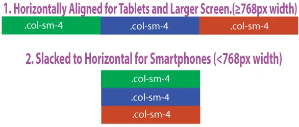
If you want to place 3 floated columns in a row for tablets (≥768px width) then use:
<div class="row">
    <div class="col-md-4">
    </div>
    <div class="col-md-4">
    </div>
    <div class="col-md-4">
    </div>
</div>
Or I can also use:
<div class="row">
    <div class="col-md-8">
    </div>
    <div class="col-md-2">
    </div>
    <div class="col-md-2">
    </div>
</div>
You may have noticed that I have changed the value of “*”.
There can be many such combinations because the count of the number for “*” is 12 (Bootstrap Grid allows only 12 columns in a row).
- .col-md-2, .col-md-2, .col-md-8
- .col-md-6, .col-md-2, .col-md-4
- .col-md-5, .col-md-5, .col-md-2
More the number for the “*” more will be the column width. Example .col-md-4 will be twice large in width as .col-md-2.
- These above 3 columns will remain on the horizontal row and side by side for tablets and large than tablets screens but for smaller than tablets screens (<768px width) they will come one down the other (slacked to horizontal).
- Let’s take the example of smartphones (use .col-* type class). In the below HTML the columns will be slacked for smartphones but for tablets and larger screen they will remain floated.
<div class="row">
    <div class="col-8">
    </div>
    <div class="col-2">
    </div>
    <div class="col-2">
    </div>
</div>
By mixing Multiple Bootstrap Grid Classes you can create even more powerful layouts. Example see the below HTML:
<div class="row">
    <div class="col-sm-8 col-lg-6"></div>
    <div class="col-sm-4 col-lg-6"></div>
</div>
The above 2 columns will be slacked horizontally only for screen sizes less than 576px. For larger screens they will remain floated.
With the Bootstrap Grid knowledge let us build the responsive design in HTML.
Using Bootstrap to Create Header Responsive
Let’s start with the creation of header. You may remember our header has a logo on the left and a div on the right side.
So inside the body tag start with a .container div. Then inside this container div put a row with 2 columns. The HTML will look like this:
<div class="container">
    <div class="row">
        <div class="col-md-5">
            <img src="Images/logo.png" class="img-fluid"/>
        </div>
        <div class="col-md-7">
            Right Header Div
        </div>
    </div>
</div>
Explanation: The responsive layout in Bootstrap should start with .container (fixed-width) or .container-fluid (full-width) div. Inside it I placed a .row class div that contains 2 columns div – .col-md-5 and col-md-7 (logo div smaller than the other).
These 2 columns divs will remain horizontally on the row (i.e. float: left;) for tablets screens and larger (≥768px width). For smaller than 768px width screens (like that of all smartphones), they will be slacked to horizontal (i.e. float: none;).
You will also note I have put img-fluid class for the logo image. This class makes the image responsive (will scale nicely for screen sizes that are smaller than the image width).
Using Bootstrap to Create Body Responsive
The body has 2 divs which are the Main Body Content and the Sidebar. To add these 2 divs I can create a new row (just after where the header row ends) and place these 2 divs inside it.
The HTML is given below:
<div class="container">
    <!--Header Row -->
    <div class="row">
        <div class="col-md-8">
            Main Body Content
        </div>
        <div class="col-md-4">
            Sidebar
        </div>
    </div>
</div>
Explanation: The HTML is quite easy to understand. After the end of header row I have put a new row for the body divs. Inside this row I placed the 2 divs for the 2 columns.
These 2 columns will remain floated for tablets and larger screen. For smartphones they will slack horizontally.
The Main Body Content div being twice the size of Sidebar div.
Using Bootstrap to Create Footer Responsive
Now only the footer is left. Just like what I did for the header and body, the HTML of the footer will be:
<div class="container">
    <!--Header Row -->
    <!--Body Row -->
    <div class="row">
        <div class="textCenter col-md-12">
            Footer
        </div>
    </div>
</div>
Explanation: The footer row contains just a single column so I made a full width column (.col-md-12).
The work of the .textCenter class is to align the text at the center. You have to define this class in our website custom CSS.
.textCenter {
    text-align: center;
}
That’s the end of the coding part. As I have successfully used Bootstrap to convert all portions of the web page to responsive ones.
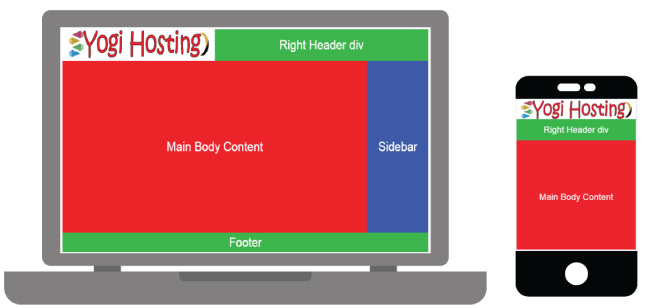
If you open the web page in laptop and iPhone, you will find the look similar to the image below:
Checking How Bootstrap Performs in Our Web Page
To check how Bootstrap Performs in our web page you can take the help of Chrome DevTools. It can be opened by right clicking on the web page in chrome browser and then select Inspect.
The DevTools window will open at the bottom of your Chrome browser. Now click on the Toggle device toolbar icon.
From here you can check how the web page will look in difference devices.
This is how we can Use Bootstrap to create any sort of Responsive Design. This is only a starting tutorial but it will provide you a good understanding of Bootstrap framework.
You can avoid Bootstrap framework and create a responsive design by using CSS Media Queries. Check the article CSS Media Queries for Responsive Web Design which covers this topic.
Have any question on Bootstrap? Why not ask it on the comment section below.
SHARE THIS ARTICLE
Related Tutorials:


ABOUT THE AUTHOR
I hope you enjoyed reading this tutorial. If it helped you then consider buying a cup of coffee for me. This will help me in writing more such good tutorials for the readers. Thank you.
Please Consider Donating us
We are helping millions of Beginners and Professionals to learn new programming technologies.
Please consider donating us:


HELLO EVERYONE
 Welcome to YogiHosting - A Programming Tutorial Website. It is used by millions of people around the world to learn and explore about ASP.NET Core, Blazor, jQuery, JavaScript, Docker, Kubernetes and other topics.
SUBSCRIBE TO NEWSLETTER
Enter your email address to subscribe to this blog and receive notifications of new posts by email.
Join 90K other subscribers