


How to Use Bootstrap to Make Images, Videos and Navbar Responsive
Almost every website includes Images, Videos, and a Navigation bar (Navbar) at the top. For a good user experience, all of these need to be responsive, meaning they adapt smoothly to any screen size, from a small phone to a large desktop monitor. Without responsive design, images can overflow the screen, videos can get cut off, and a navbar can become impossible to use on a small device.
Bootstrap, a popular front-end framework, solves this problem with ready-made classes and components. Instead of writing a lot of custom CSS and media queries yourself, you can make your layout mobile friendly by adding a few classes to your HTML.
In this tutorial, I will explain everything from scratch. You will learn how to:
- Make images responsive so they scale with their container.
- Embed videos that resize properly on every screen.
- Build a navbar that collapses into a toggle menu on smaller devices.
By the end, you will be able to create a mobile-friendly website using Bootstrap, even if you are just getting started.
If you are a beginner in Bootstrap then I would recommend to first read the below tutorial:
Bootstrap Responsive Image
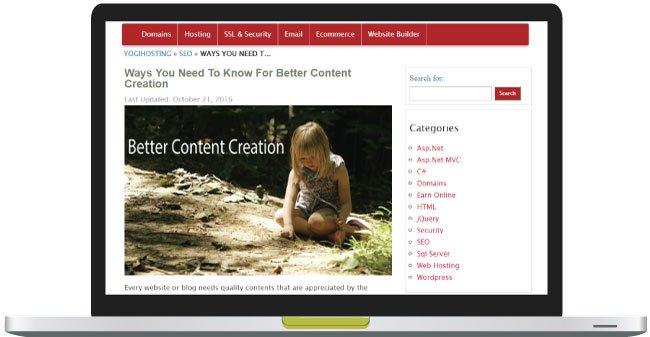
The images whose original sizes are bigger than the screen width of the viewing machine have to be resized. For this we make them responsive using Bootstrap.
Suppose if the width of the image is 500 pixels. When viewing it on iPhone 8 (whose screen width is 375 pixels) then Bootstrap will resize this image to a smaller size and thus making it to fit on the iPhone’s screen.
To be more precise the width of the image is scaled down according to the column’s width where it is placed.
To make Responsive image with Bootstrap you just have to place img-fluid class on the img tag:
<img src="bigphoto.jpg" class="img-fluid" alt="bootstrap responsive image"/>When the .img-fluid class is applied to an image, it makes the image scale with its parent container. Bootstrap does this with max-width: 100% and height: auto, so the image never grows wider than its container and keeps its proportions as the screen size changes.

Check my article on CSS Media Queries to understand how responsiveness is achieved without Bootstrap.
Small images like icons have much smaller width than any smartphone’s screen so it is of no use to resize them. Therefore don’t apply img-fluid class to small size images.
Bootstrap Responsive Video
We can put a video in a web page either by using <video> tag or embed it from other sites like Youtube.
We can embed the videos by using the following 3 tags which are – <iframe>, <embed>, <video> or <object> tags.
To make a video responsive, place it inside a div that has these classes:
- 1. ratio
- 2. One of the aspect-ratio classes: ratio-21×9, ratio-16×9, ratio-4×3, or ratio-1×1
The ratio class sets the video’s aspect ratio. For example, ratio-16x9 gives a 16:9 ratio and ratio-4x3 gives 4:3.
The video element (<iframe>, <video>, <embed>, or <object>) goes directly inside the wrapper. No extra class is needed on it, because Bootstrap 5 sizes any direct child of .ratio automatically.
Example:
<div class="ratio ratio-16x9">
    <iframe src="https://www.youtube.com/embed/lfFo_SwmRa4"
            title="YouTube video"
            allowfullscreen></iframe>
</div>
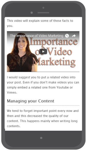
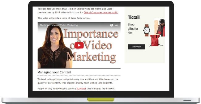
We all use videos in our website and mostly embed them from Youtube so like images they also need to be made responsive.
Bootstrap Navbar
The Bootstrap navbar (navigation bar) is used to create a Responsive Menu at the top of a website. On larger screens such as laptops and desktops, the navbar is displayed in full. On smaller screens such as tablets and phones, it collapses into a compact form with a Toggle Button (often called a “hamburger” icon). Clicking this button expands or hides the menu.
The HTML Code of Bootstrap Navbar is given below:
<nav class="navbar navbar-expand-lg navbar-light bg-light">
  <div class="container-fluid">
    <a class="navbar-brand" href="#">Navbar</a>
    <button class="navbar-toggler" type="button" data-bs-toggle="collapse" data-bs-target="#navbarSupportedContent" aria-controls="navbarSupportedContent" aria-expanded="false" aria-label="Toggle navigation">
      <span class="navbar-toggler-icon"></span>
    </button>
    <div class="collapse navbar-collapse" id="navbarSupportedContent">
      <ul class="navbar-nav me-auto mb-2 mb-lg-0">
        <li class="nav-item">
          <a class="nav-link active" aria-current="page" href="#">Home</a>
        </li>
        <li class="nav-item">
          <a class="nav-link" href="#">Link</a>
        </li>
        <li class="nav-item dropdown">
          <a class="nav-link dropdown-toggle" href="#" id="navbarDropdown" role="button" data-bs-toggle="dropdown" aria-expanded="false">
            Dropdown
          </a>
          <ul class="dropdown-menu" aria-labelledby="navbarDropdown">
            <li><a class="dropdown-item" href="#">Action</a></li>
            <li><a class="dropdown-item" href="#">Another action</a></li>
            <li><hr class="dropdown-divider"></li>
            <li><a class="dropdown-item" href="#">Something else here</a></li>
          </ul>
        </li>
        <li class="nav-item">
          <a class="nav-link disabled" href="#" tabindex="-1" aria-disabled="true">Disabled</a>
        </li>
      </ul>
      <form class="d-flex">
        <input class="form-control me-2" type="search" placeholder="Search" aria-label="Search">
        <button class="btn btn-outline-success" type="submit">Search</button>
      </form>
    </div>
  </div>
</nav>
The most important thing to note in the above code is to put the website links inside the <ul class=”navbar-nav”> tag.
The below image shows how the Bootstrap Navbar looks in big and small screens.
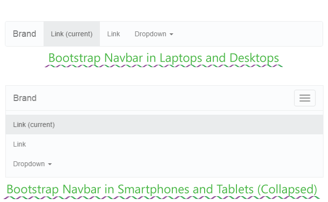
All websites uses Images, Videos and Navbar in their different pages so it is important that you should also apply Bootstrap responsive features into these three things. The purpose of this tutorial is to make you comfortable with important areas of Bootstrap and I hope it accomplishes it.
Please share this tutorial with your friends and give it the necessary exposure. Thank You!
SHARE THIS ARTICLE


Related Tutorials:





ABOUT THE AUTHOR
I hope you enjoyed reading this tutorial. If it helped you then consider buying a cup of coffee for me. This will help me in writing more such good tutorials for the readers. Thank you.
Please Consider Donating us
We are helping millions of Beginners and Professionals to learn new programming technologies.
Please consider donating us:




HELLO EVERYONE
 Welcome to YogiHosting - A Programming Tutorial Website. It is used by millions of people around the world to learn and explore about ASP.NET Core, Blazor, jQuery, JavaScript, Docker, Kubernetes and other topics.
SUBSCRIBE TO NEWSLETTER
Enter your email address to subscribe to this blog and receive notifications of new posts by email.
Join 90K other subscribers