Fantastic Ways to Make Website Navigation Bar Look Staggering

A Website Navigation Bar helps the user to explore a website and get the information they are searching for. It should be simple and easy to use, with your main links of your site. Navigation bar is important since the visitors are performing call to action on the links placed on the navigation bar.
There are many ways by which you can make your website navigation bar attractive so that it catches the eyeballs of the visitors. These ways are:
- Put some animations into it by using CSS and jQuery.
- Highlight some major links which you consider as a revenue booster for your site.
- Put attractive images on the items of your navigation bar.
- Change the orientation of the bar from horizontal to vertical.
In this tutorial I will explain you these things including jQuery to create staggering navigation bar.
CSS3 Navigation Bar with Animation
Do you know that the CSS3 transitions are a great way to bring out animated effects? They cause property changes to take place over a time period with some animation effect. I will be using it in the navigation bar.
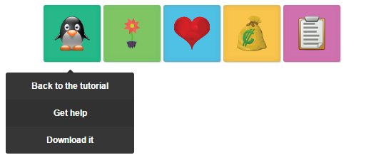
- On every item’s mouse hover property, I am setting the max-width property on the sub-menu item, and that’s the reason why it shows up, whenever mouse is placed on the navigation bar item.
- I applied the transaction on max-width property to bring out the animation.
HTML
<nav id="menu">
    <ul>
        <li class="green">
            <img src="image/penguin.svg"/>
            <ul>
                <li><a href="#">Back to the tutorial</a></li>
                <li><a href="#">Get help</a></li>
                <li><a href="#">Download it</a></li>
            </ul>
        </li>
        <li class="red">
            <img src="image/flower.svg"/>
            <ul>
                <li><a href="#">Payment</a></li>
                <li><a href="#">Notifications</a></li>
                <li><a href="#">Privacy</a></li>
                <li><a href="#">Settings</a></li>
            </ul>
        </li>
        <li class="blue">
            <img src="image/heart.svg"/>
            <ul>
                <li><a href="http://twitter.com/yogihosting">Follow us on Twitter</a></li>
                <li><a href="http://www.facebook.com/yogihosting">Find us on Facebook</a></li>
            </ul>
        </li>
        <li class="yellow">
            <img src="image/money.svg"/>
            <ul>
                <li><a href="https://www.yogihosting.com/category/wordpress/">WordPress Tutorials</a></li>
                <li><a href="https://www.yogihosting.com/category/jquery/">jQuery Tutorials</a></li>
                <li><a href="https://www.yogihosting.com/category/html/">HTML Tutorials</a></li>
                <li><a href="https://www.yogihosting.com">Everything else</a></li>
            </ul>
        </li>
        <li class="purple">
            <img src="image/clipboard.svg"/>
            <ul>
                <li><a href="https://www.yogihosting.com">Contact us</a></li>
            </ul>
        </li>
    </ul>
</nav>
CSS
#menu > ul {
    width: 450px;
    margin: 0 auto;
}

    menu > ul > li {
        list-style: none;
        box-shadow: 0 0 10px rgba(100, 100, 100, 0.2) inset,1px 1px 1px #CCC;
        display: inline-block;
        border-radius: 3px;
        position: relative;
        width: 80px;
        height: 80px;
    }

        menu > ul > li > img {
            width: 50px;
            height: 50px;
            padding: 15px;
        }

            #menu > ul > li > a {
                color: inherit;
                text-decoration: none !important;
                font-size: 24px;
                padding: 25px;
            }

        #menu li ul {
            position: absolute;
            list-style: none;
            text-align: center;
            width: 180px;
            left: 50%;
            margin-left: -133px;
            top: 70px;
            font: bold 12px 'Open Sans Condensed', sans-serif;
            /* This is transition applied on max-height */
            max-height: 0px;
            overflow: hidden;
            -webkit-transition: max-height 0.4s linear;
            -moz-transition: max-height 0.4s linear;
            transition: max-height 0.4s linear;
        }

            #menu li ul li {
                background-color: #313131;
            }

                #menu li ul li a {
                    padding: 12px;
                    color: #fff !important;
                    text-decoration: none !important;
                    display: block;
                }

                #menu li ul li:nth-child(odd) { /* zebra stripes */
                    background-color: #363636;
                }

                #menu li ul li:hover {
                    background-color: #444;
                }

                #menu li ul li:first-child {
                    border-radius: 3px 3px 0 0;
                    margin-top: 25px;
                    position: relative;
                }

                    /*For the small traingle*/
                    #menu li ul li:first-child:before {
                        content: '';
                        position: absolute;
                        width: 1px;
                        height: 1px;
                        border: 5px solid transparent;
                        border-bottom-color: #313131;
                        left: 50%;
                        top: -10px;
                        margin-left: -5px;
                    }
                /*End*/

                #menu li ul li:last-child {
                    border-bottom-left-radius: 3px;
                    border-bottom-right-radius: 3px;
                }

        /*Transition effect applied to this for showing animation*/
        #menu li:hover ul {
            max-height: 200px;
        }
        /*End*/

        #menu li.green {
            background-color: #00c08b;
        }

        #menu li.red {
            background-color: #74d864;
        }

        #menu li.blue {
            background-color: #53bfe2;
        }

        #menu li.yellow {
            background-color: #f8c54d;
        }

        #menu li.purple {
            background-color: #df6dc2;
        }
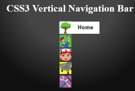
CSS3 Vertical Navigation Bar
Sometimes we want to show our navigation bar in vertical position. You can do this by using CSS.
- Showing the items one below the other.
- Keep the sub-items inside span element and give them the width as 0. This is done to keep them hidden by default.
- On the mouse hover property of the items, make the sub-items width as auto. This makes them visible when the mouse is kept them.
- Transition on items will bring an animation effect.
HTML
<div id="main">
    <ul id="menu">
        <li>
            <a class="home" href="#">
                <span>Home</span>
            </a>
        </li>

        <li>
            <a class="about" href="#">
                <span>About Us</span>
            </a>
        </li>

        <li>
            <a class="help" href="#">
                <span>Help</span>
            </a>
        </li>

        <li>
            <a class="shop" href="#">
                <span>Shop</span>
            </a>
        </li>

        <li>
            <a class="guide" href="#">
                <span>Guide</span>
            </a>
        </li>
    </ul>
</div>
CSS
#menu li {
            list-style: none;
            height: 39px;
            padding: 2px;
            width: 40px;
        }

        #menu span {
            width: 0;
            left: 38px;
            padding: 0;
            position: absolute;
            overflow: hidden;
            font-size: 18px;
            font-weight: bold;
            letter-spacing: 0.6px;
            white-space: nowrap;
            line-height: 39px;
            /*Transition*/
            -webkit-transition: 0.25s;
            -moz-transition: 0.25s;
            transition: 0.25s;
        }

        #menu a {
            height: 39px;
            width: 38px;
            display: block;
            position: relative;
        }

            /* Hover styles on items */
            #menu a:hover span {
                width: auto;
                padding: 0 20px;
                overflow: visible;
            }

            #menu a:hover {
                text-decoration: none;
                -moz-box-shadow: 0 0 5px #9ddff5;
                -webkit-box-shadow: 0 0 5px #9ddff5;
                box-shadow: 0 0 5px #9ddff5;
            }

        /*Items with Images*/
        #menu .home {
            background: url("image/tree.jpg") no-repeat;
        }

            #menu .home span {
                background-color: #FFF;
                color: #333;
                text-shadow: 1px 1px 0 #93bfb1;
            }

        #menu .about {
            background: url("image/plumber.jpg") no-repeat;
        }

            #menu .about span {
                background-color: #44d32f;
                color: #213b44;
                text-shadow: 1px 1px 0 #42d8d0;
            }

        #menu .help {
            background: url("image/nurse.jpg") no-repeat;
        }

            #menu .help span {
                background-color: #848484;
                color: #3a5517;
                text-shadow: 1px 1px 0 #d28364;
            }

        #menu .shop {
            background: url("image/cart.jpg") no-repeat;
        }

            #menu .shop span {
                background-color: #fcf122;
                color: #604f18;
                text-shadow: 1px 1px 0 #d8b43b;
            }

        #menu .guide {
            background: url("image/hammer.jpg") no-repeat;
        }

            #menu .guide span {
                background-color: #d650d6;
                color: #560f31;
                text-shadow: 1px 1px 0 #3243b6;
            }

        #main {
            margin: 80px auto;
            position: relative;
            width: 150px;
        }
Download link:
Flashing Navigation Bar
Human eyes catches flashing thing more than anything else. Therefore creating a flashing border over the navigation bar items can be a good option to bring more user clicks.

- Adding and removing the menu item border will provide the flashing effect.
- Loop through each menu item, and then add the border for 1 second and then remove the border.
- This feature can be made with setInterval JavaScript method.
The navigation bar structure is based on ul and li tags like shown below:
<ul id="menu">
    <li><a href="#">Home</a></li>
    <li><a href="#">Shop Apply</a></li>
    <li><a href="#">What We Do</a></li>
    <li><a href="#">The Broker</a></li>
</ul>
The jQuery Code that will add and remove the border after every 1 second is given below:
<script src="https://ajax.googleapis.com/ajax/libs/jquery/3.1.0/jquery.min.js"></script>

<script type="text/javascript">
    $(document).ready(function ($) {
        var items = $("#menu > li").length;
        setInterval(function () {
            reveal_board();
        }, items*1000);
        function reveal_board() {
            $("#menu > li").each(function (index) {
                (function (that, i) {
                    var t = setTimeout(function () {
                        $(that).addClass("menuFlashBorder");
                    }, 1000 * (i + 1));
                })(this, index);
                (function (that, i) {
                    var t = setTimeout(function () {
                        $(that).removeClass("menuFlashBorder");
                    }, ((1000 * (i + 1)) + 1000));
                })(this, index);
            });
        }
    });
</script>
CSS code for the border is:
.menuFlashBorder {
    border-left: 2px dashed #304351;
    border-right: 2px dashed #304351;
}
The function called reveal_board does the main work of looping through every menu item. By using the jQuery addClass() method, it places the border to them in turns, and then after 1 second, removes this border with jQuery removeClass() function.
I call the reveal_board function after every few seconds based on how many items I have in the menu (i.e. 4 seconds for 4 items, 5 seconds for 5 items, and so on).
I calculated the total items using the length function of JavaScript.
Navigation Bar with Images
Few links in Navigation Bar can be made different so that stands out of the rest. This is helpful in getting more clicks to these links.
You can do this by putting a background image in these links.
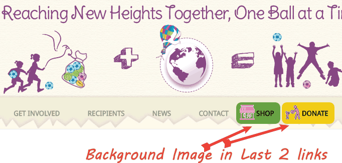
CSS code for this effect –
#menu > li:last-child {
    border-radius: 10px;
    background: url("images/heart.png") no-repeat scroll 7px 5px #F1CB16;
}

#menu > li:nth-last-child(2) {
    border-radius: 10px;
    background: url("images/basket.png") no-repeat scroll 7px 5px #67A031;
}
I am providing background image to the last and second last links of the navigation bar. I do this with the CSS properties called last-child and nth-last-child(2).
Tab Navigation Bar
Some people prefer the tab look for the navigation bar. It’s features include slanting edges and round corners. The most interesting thing is that this design purely with CSS with no use of jQuery at all.
HTML
<ul id="menu">
    <li class="active"><a href="#">Home</a></li>
    <li><a href="#">Products</a></li>
    <li><a href="#">Company</a></li>
    <li><a href="#">Contact</a></li>
</ul>
CSS
#menu {
    border-bottom: 3px solid #36c5af;
    list-style: none;
    display: inline-block;
    padding: 0;
}

    #menu li {
        float: left;
        position: relative;
    }

        #menu li a {
            text-decoration: none;
            color: #333;
            padding: 18px 25px 12px 25px;
            line-height: 35px;
        }

    #menu > li.active > a:after, #menu > li > a:hover:after {
        background: #ff6a00;
        position: absolute;
        left: 0;
        bottom: 0;
        right: 0;
        z-index: -1;
        width: 100%;
        height: 120%;
        border-top-left-radius: 8px;
        border-top-right-radius: 8px;
        content: "";
        transform: perspective(5px) rotateX(2deg);
        transform-origin: bottom;
    }

    #menu li.active a, #menu li a:hover {
        color: #FFF;
    }
View Tab Navigation Bar:
I hope this tutorial will certainly help you to create some stunning website navigation bars. Take some idea from here and modify the code to create even better navigation bar designs.
Want to share your comments? We will love to have it.
Do share this tutorial with your friend’s using the social share buttons given below.
SHARE THIS ARTICLE
Related Tutorials:


ABOUT THE AUTHOR
I hope you enjoyed reading this tutorial. If it helped you then consider buying a cup of coffee for me. This will help me in writing more such good tutorials for the readers. Thank you.

HELLO EVERYONE
 Welcome to YogiHosting - A Programming Tutorial Website. It is used by millions of people around the world to learn and explore about ASP.NET Core, Blazor, jQuery, JavaScript, Docker, Kubernetes and other topics.
SUBSCRIBE TO NEWSLETTER
Enter your email address to subscribe to this blog and receive notifications of new posts by email.
Join 90K other subscribers